Plotting Menu: Difference between revisions
Jump to navigation
Jump to search
Created page with "This menu allows fast and straightforward way to represent the spreadsheet data in the form of various scatter plots.<br><br> Image:Spreadsheet Plotting Menu.png<br><br> ..." |
No edit summary |
||
| Line 6: | Line 6: | ||
<li>'''Add new''' - Click to add a new scatter plot to the spreadsheet. The setup controls for a newly created scatter plot always appear on the right-most side of the '''Scatter Menu''' toolbar.</li><br> | <li>'''Add new''' - Click to add a new scatter plot to the spreadsheet. The setup controls for a newly created scatter plot always appear on the right-most side of the '''Scatter Menu''' toolbar.</li><br> | ||
<li>Press the [[Image:Xbutton.png]] button to designate the currently active column as a source for the X axis values. Analogously, clicking the [[Image:Ybutton.png]] button define the data points contained in a selected column as the ones that should be put on a vertical Y axis. The fact that the currently selected column has been selected as source of X or Y values is represented in the toolbar, by shading any of the pictograms for the corresponding scatter plot. Repeatedly clicking such active buttons cancels the use of the corresponding column data in that particular scatter and returns the X or Y data source setting to the undefined state. The names of the columns set as the scatter plot axes define the name of the scatter, which is displayed in the following format: "X vs Y". <!--Whenever both X and Y sources have been correctly defined, the '''Scatter plot''' window is displayed automatically.--><br><br> | <li>Press the [[Image:Xbutton.png]] button to designate the currently active column as a source for the X axis values. Analogously, clicking the [[Image:Ybutton.png]] button define the data points contained in a selected column as the ones that should be put on a vertical Y axis. The fact that the currently selected column has been selected as source of X or Y values is represented in the toolbar, by shading any of the pictograms for the corresponding scatter plot. Repeatedly clicking such active buttons cancels the use of the corresponding column data in that particular scatter and returns the X or Y data source setting to the undefined state. The names of the columns set as the scatter plot axes define the name of the scatter, which is displayed in the following format: "X vs Y". <!--Whenever both X and Y sources have been correctly defined, the '''Scatter plot''' window is displayed automatically.--><br><br> | ||
[[Image: | [[Image:scatter window.png|center]]<br> | ||
<ol style="list-style-type:lower-latin"> | <ol style="list-style-type:lower-latin"> | ||
| Line 31: | Line 31: | ||
<li>Click to append a callout with a 2-D structure view and its coordinates to the selected data point. Click and drag to place the callout anywhere you want in the '''Graph''' pane. The line conjunctive to a corresponding data point appears. The callout can be minimized by clicking _ and closed by clicking X. You can place as many callouts as you need.</li> | <li>Click to append a callout with a 2-D structure view and its coordinates to the selected data point. Click and drag to place the callout anywhere you want in the '''Graph''' pane. The line conjunctive to a corresponding data point appears. The callout can be minimized by clicking _ and closed by clicking X. You can place as many callouts as you need.</li> | ||
<li>Click to display the available trendline information. <br><br>[[Image: | <li>Click to display the available trendline information. <br><br>[[Image:scatter with trendline.png|center]]<br></li> | ||
<li>Check the box to display the corresponding trendline in the '''Graph''' pane.</li> | <li>Check the box to display the corresponding trendline in the '''Graph''' pane.</li> | ||
Revision as of 14:50, 4 July 2012
This menu allows fast and straightforward way to represent the spreadsheet data in the form of various scatter plots.
- Add new - Click to add a new scatter plot to the spreadsheet. The setup controls for a newly created scatter plot always appear on the right-most side of the Scatter Menu toolbar.
- Press the
 button to designate the currently active column as a source for the X axis values. Analogously, clicking the
  button define the data points contained in a selected column as the ones that should be put on a vertical Y axis. The fact that the currently selected column has been selected as source of X or Y values is represented in the toolbar, by shading any of the pictograms for the corresponding scatter plot. Repeatedly clicking such active buttons cancels the use of the corresponding column data in that particular scatter and returns the X or Y data source setting to the undefined state. The names of the columns set as the scatter plot axes define the name of the scatter, which is displayed in the following format: "X vs Y".

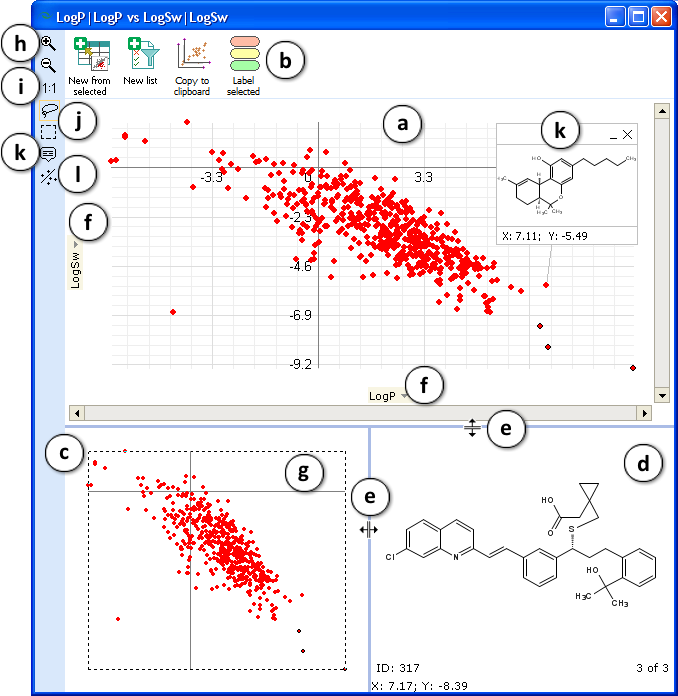
- The Graph pane displays a 2-D scatter plot (XY chart) showing the relationships among the numeric values in several data series or plots two groups of numbers as one series of XY coordinates.
- The Toolbar menu allows to transfer the selected data points to a new spreadsheet project (New from selected) or create a list from selection (New list), as well as to copy the view of the Graph pane view between WindowsTM applications (Copy to clipboard).
- The Navigator pane always displays the full scatter plot as well as areas that have been zoomed and selected in the Graph pane.
- The Molecule pane displays the 2-D structure corresponding to a data point in the scatter plot that is being hovered above by a mouse pointer. Select the molecule by using the available tools to continue displaying its structure even when the mouse is no longer over the corresponding point. If a group of compounds is selected, the structures of all of them will cycle in a continuous loop in this pane. Also there are displayed: ID number and coordinates of the corresponding structure, total and current number of marked data points in the selected area.
- The size and positions of the Navigator and Molecule panes can be changed by dragging their boundaries.
- Click to expand the drop-down list of all columns available as a source for the X and Y axis values. Change X or Y axis values if needed.
- The dotted line indicates current zoom area. Click and drag within it to move the zoomed area.
- Click and drag to select the area to zoom in/zoom out.
- Click to cancel zooming and return the scatter plot to the original view.
- Use the Rectangular Selection or Lasso Selection tools for selecting data points by clicking and dragging the mouse pointer within the scatter plot area.
- Click to append a callout with a 2-D structure view and its coordinates to the selected data point. Click and drag to place the callout anywhere you want in the Graph pane. The line conjunctive to a corresponding data point appears. The callout can be minimized by clicking _ and closed by clicking X. You can place as many callouts as you need.
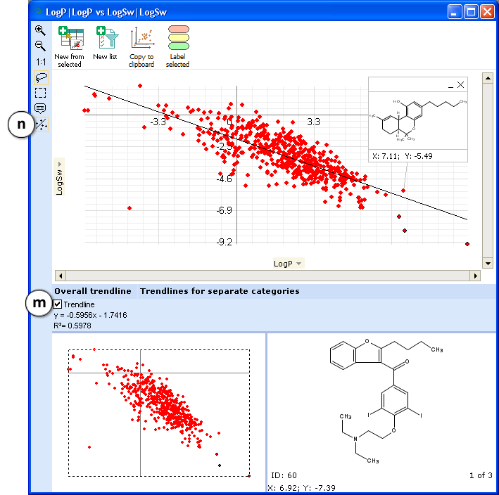
- Click to display the available trendline information.

- Check the box to display the corresponding trendline in the Graph pane.
- Click again to hide all the trendline information.
- Whenever a mouse is clicked on a main program window of the ACD/Percepta, any graphs visible at the time become hidden. To bring any of them back to the top and into focus, use the eye pictograms in the corresponding scatter plot setup controls.
- Click to delete the corresponding scatter plot.
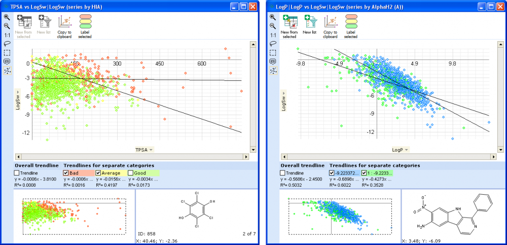
- Any column containing either qualitative category data (Good, Average, Bad, Unknown) or continuous data that has been split into several intervals can be used to classify all the scatter data points into several series depending on which qualitative category or property value interval they belong to. In order to do so, select the appropriately configured column and press the
 button in the setup controls of the particular scatter plot. The data points in the scatter plot belonging to different series will become colored in the very same manner as are the corresponding cells in the spreadsheet falling within different categories or property value intervals. At the same time additional trendline information for each compound series becomes available along with the general trendline, allowing for separate correlation investigations within each of the compound groups.

